There’s a very popular book written by Harold Stolovitch and Erica Keeps called Tellin’ Ain’t Training. I saw it on my bookshelf the other day and realized the same sentiment holds true for PowerPoint presentations: just because you are clicking through slides does not mean your message is landing with your audience, and it certainly doesn’t mean you are connecting with them.
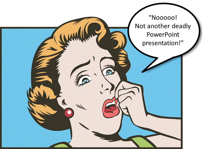
I just heard the fourth person in three weeks tell his or her staff to stop making decks for management meetings. Dare I even ask if corporate America is finally coming around to the fact that 100-slide decks are ruining our attention span and our good nature?! One can only hope. Until that time, there are a few things we can all do to improve our use of visual display.
The Power of the Right Image.  Not just any old image, and never – ever – tacky clip art or stick figure guy!
Visuals can help or hurt your presentation. Done well, images can help a speaker be more persuasive, more credible, and more emotive. They can simplify a complex idea, and they can even garner an audible gasp from the audience, as one presenter did simply by showing the difference between a beach in the  U.S. and a beach in China. At this point in the presentation, the speaker was a bit dull and rather dry. When the slide advanced to the second image (above right), the audience responded exactly as he had intended. Everyone was focused and listening to his key message.
Have you received feedback on your image choices? Do they amplify your message or do they interfere? Do you need to find higher resolution versions or simply improve their placement? The next question is: can any of your text slides be replaced by images or other graphics? Hint: I already know the answer to that question. If you are ready to give your decks a makeover, start with this checklist:
1. Can your visuals be seen from the back of the room? Font size and image size are critical. Too many decks are being displayed with 18-pt, even 14-pt font sizes. That’s fine if you are presenting in a shoe box. Otherwise, put your hand on the mouse and click the “up arrow” at least four levels.
2. Is your message clear? Don’t take your own word for it, show the slides to someone you trust and ask them to tell you the message.
3. Are you using good graphic design rules like the Rule of Thirds? Break up your canvas into three sections for increased impact. Audience members learn more from your text when combined with an image in an elegant and clear manner. Here’s an example with the title text, a quote and an image.
4. Do you need to edit? And edit some more? Let’s not forget the infamous “spaghetti slide” used by the U.S. military back in 2009 to explain why the war in Afghanistan was so expensive and protracted. The story goes that after seeing the slide, General McChrystal said, “When we understand that slide, we’ll win the war.”

Finally, make an honest assessment of your first and last slides. Spend the time to find just the right image to convey the most important word in your presentation title. And for your final slide, stay away from cutesy question marks. Even if that’s all the time you have, it will be well spent.
Go forth and click.
– Barbara