 Ever since I heard Edward Tufte say that ESPN sports graphics were the go-to resource for anyone trying to display numbers in a meaningful way, I have had my eye out for any worthy examples. I knew he was right from personal experience. My best friend’s son learned to read from the baseball box scores in the Boston Globe. I’ve seen several charts since then that support Tufte’s claim, but it wasn’t until last Saturday that I stopped in my tracks and stared at the TV screen. I yelled to my husband, “What the hell is this?!”
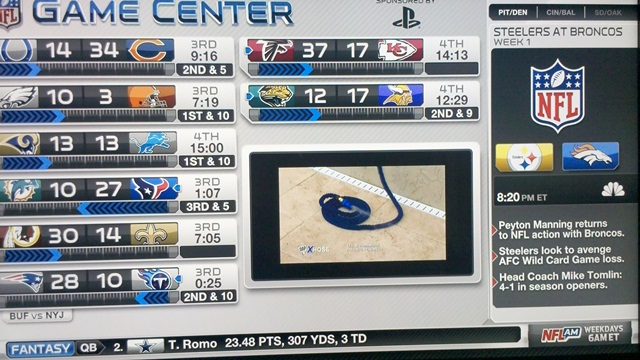
I had walked into “the sports room” in our house to see if the Patriots game was being televised. I knew that I would find my husband settled on his favorite couch flipping back and forth between football and golf. He said, “That’s the NFL Network’s Game Chart,” in a tone that implied “How do you not know that?”
This chart is a marvel to behold. First, the white background and clear, crisp colors make it easy on the eyes (yet another Tufte reference: optical tremble). Next, the data is organized so well that you can find what you’re looking for without furrowing your brow or tilting your head. But there’s more! This “thing” (it seems unfair to call it a chart) gives you not just the scores, but the downs and the time and the quarter. It’s amazing. And there’s more! It even shows you who has the ball! The photo above was my feeble attempt to capture the chart, but the center screen had switched over from data to commercial, so it’s not at its most impressive.
Now, there is one caveat. When this chart is displayed on a 55-inch Sony 1080p 120Hz HDTV, it looks amazing. We got this TV to watch the Red Sox, the Pats, and the PGA. I did not realize it was going to help me write a blog post!
If you have the NFL Network, and you have to create a PowerPoint deck with lots of numbers in the coming weeks, check out this chart on Saturday so you can see what the data display experts consider a good visual.
– Barbara
