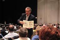
 Edward Tufte (ET) is Professor Emeritus at Yale University. He is the author of four books on visual display, including the most recent, Beautiful Evidence. ET was recently appointed to the Obama Administration’s Recovery Act Accountability and Transparency Board.
Barbara (BR): I’ve wanted to attend ET’s workshop on presenting data effectively for the last three years. I know from my work at Wharton that he is the definitive source on this topic. I finally got the opportunity last Friday, and I invited my partner in crime to join me.
Charlotte (CD): My thought was, if Barbara wants to do it, I’m in. What’s the downside of spending a few hours listening to a renowned scholar’s thoughts on data display?
BR: I loved it. I took away several insightful and relevant ideas about what is wrong with the average data presentation. I also enjoyed how direct he was. No need to spend any mental energy trying to parse his words. You know exactly what he means when he accuses a presenter of using “cartoony arrows” and “hand-waving to distract from the cherry-picking of data.”
 CD: Really? I was seriously distracted all day. After I got over what a disconnected speaker he is, I was able to surface for moments and be amazed by his brilliance. His explanation of the Charles Minard map depicting the War of 1812 was fascinating.
BR: I figured you were having some trouble when you turned to me and asked, “What time does Happy Hour start?” I was still committed and interested. Partly because he captured my attention early on by saying, “Clutter and confusion are failures of design.” That was my first Aha! moment.
CD: I agree. I found the intellectual stream of consciousness to be intriguing, confusing and a show unto itself. I was wearing the hat of the audience member and another as the presentation critic so I was bouncing back and forth. That said, he got me when he talked about the audience as a consumer. That’s a wonderful shift in thinking.
BR: Absolutely. His claim that most data presentations are “astonishingly thin” and “nearly content-free” was hard to hear, but true. His research shows that a PPT presentation contains an average of 12 numbers per chart/graph whereas and ESPN data chart contains an average of 120 numbers.
CD: Yes! There is a difference between “simple” and “simplistic.” It was crystal clear that the man hates PowerPoint. I confess I enjoyed his informed, semi-elitist point of view about this. More from me on this later.
BR: I nearly trembled when he talked about “optical tremble” (the rate at which light passes through the retina). My inner geek was very happy. I should have been a scientist.
CD: I really appreciated this idea too. I thought his metaphor of PowerPoint as a noisy restaurant was spot-on: everyone is getting louder and no one can hear a thing.
BR: Let’s wrap this up so we don’t violate our own advice about information overload. My parting takeaway is “Don’t spend so much time on making your presentation sizzle, spend that time making it right.” Well, that was my public takeaway. My private takeaway was to never let Edward Tufte call my presentations ‘flabby’ or ‘intellectually impoverished’.”
CD: And he said to use Gill Sans for your data charts! My final thought is that renowned and famous people can get away with less than stellar presentations. See you at the bar!


